2.2 Data Visualization
I’ll start by defining a caption for plots stating the source of the data.
data_caption <- "Data source: World Bank (WDI R package), Indicator: SP.POP.TOTL"2.2.1 Total world population
First we look at world population as a whole. hmm, I wonder how does the world population look like over the years?
country_pop %>%
filter(country == "World") %>% #select total world population
ggplot(aes(year, SP.POP.TOTL))+
geom_point(alpha = 0.56)+
geom_line()+
labs(x = "Year",
y = "Population",
title = "Total world population",
subtitle = "Global population between 1960 and 2021, one-year interval",
caption = data_caption)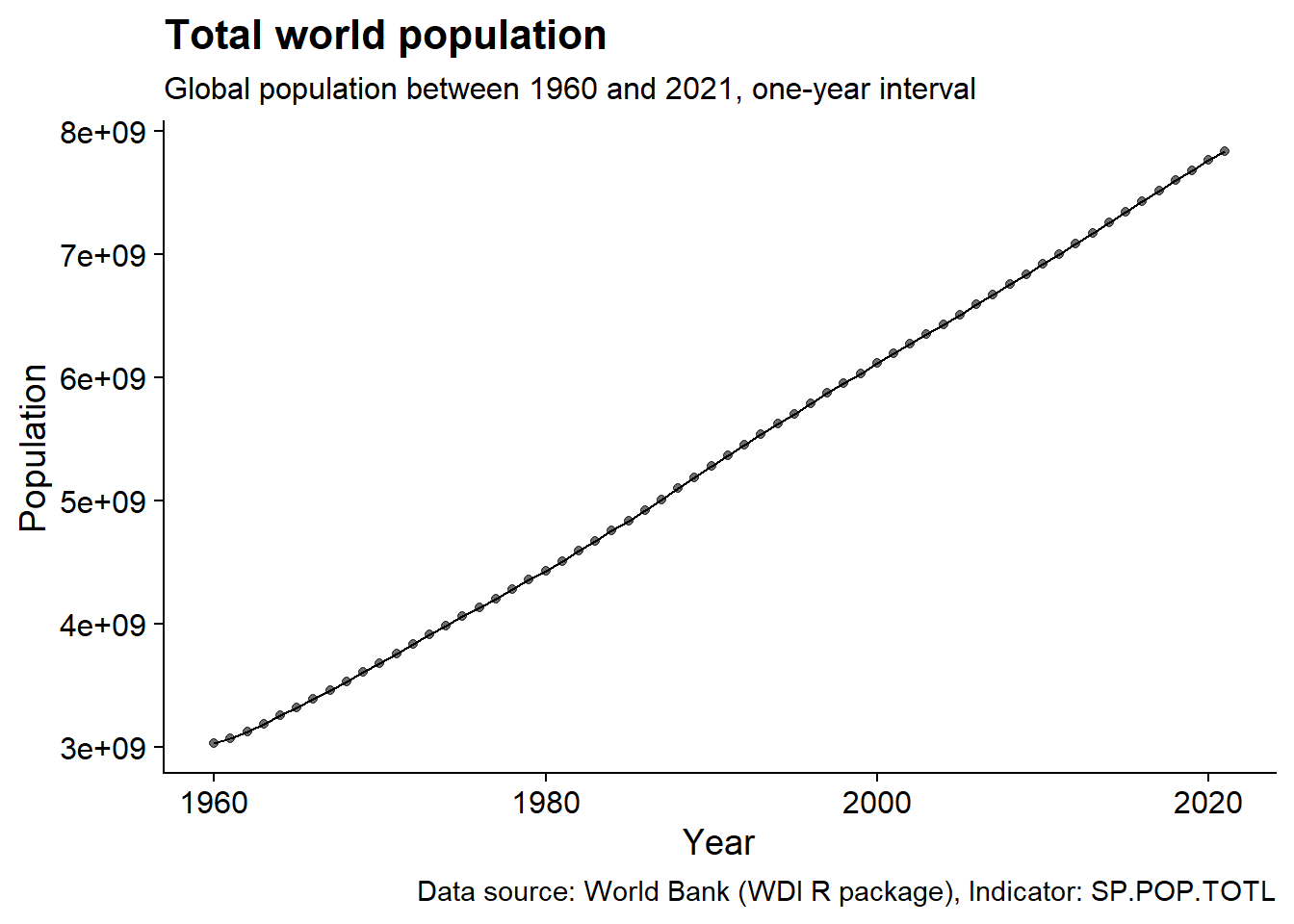 The plot shows the increase world population from 3 billions to almost 8 billions between 1960 and 2021.
Let’s have a better understanding of this increase by looking at the annual growth since 1960.
diff_growth <- country_pop %>%
filter(country == "World") %>%
arrange(year) %>%
mutate(SP.POP.TOTL_diff = SP.POP.TOTL- lag(SP.POP.TOTL)) %>% #subtract each ear from the previous
na.omit()%>% #remove 1960
ggplot(aes(year, SP.POP.TOTL_diff))+
geom_line()+
geom_vline(xintercept = c(1990, 2013, 2017),
lty = 2,
color = "blue")+
labs(x = "Year",
y = "Population",
title = "Annual growth of world population ",
subtitle = "Absolute annual growth: difference between two subsequent years",
caption = data_caption)+
labs(y = "Population", x = "Year")
diff_growth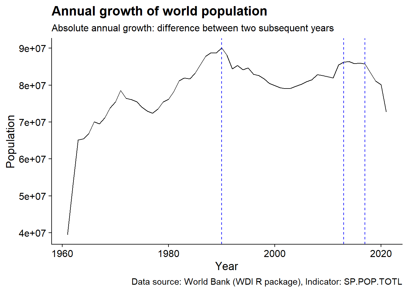 We can see that around 1990 the annual growth peaked to around 90 millions. Around 2013 the annual growth hit a plateau followed by a decreasing pattern around 2017.
We can also study the annual population growth by looking at the relative increase rather than the absolute.
rel_growth <- country_pop %>%
filter(country == "World") %>%
arrange(year) %>%
mutate(SP.POP.TOTL_diff = (SP.POP.TOTL-lag(SP.POP.TOTL))/lag(SP.POP.TOTL)) %>%
na.omit()%>%
ggplot(aes(year, SP.POP.TOTL_diff))+
geom_line()+
geom_hline(yintercept = 0.01,
lty = 2,
color = "red")+
geom_vline(xintercept = c(1990),
lty = 2,
color = "blue")+
scale_y_continuous(labels = scales::percent_format())+
labs(x = "Year",
y = "Percentage",
title = "",
subtitle = "Relative annual growth: divison of two subsequent years",
caption = data_caption)
rel_growth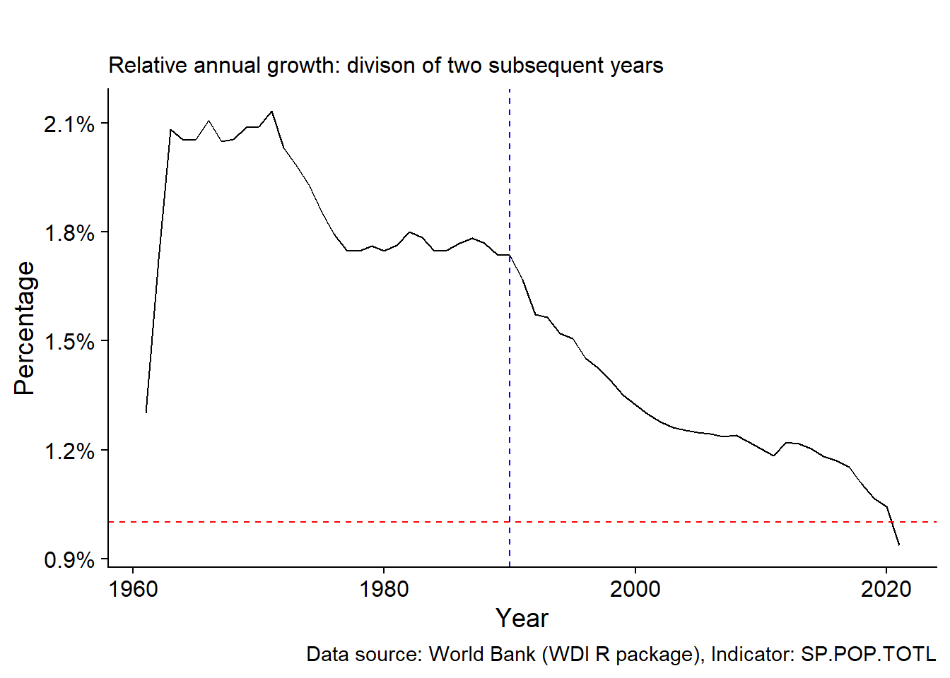 Here we can clearly see the decrease in population growth after 1990, dropping below 1% around 2020.
Let’ combine these two complementary views of the world population growth in a single plot.
diff_growth/rel_growth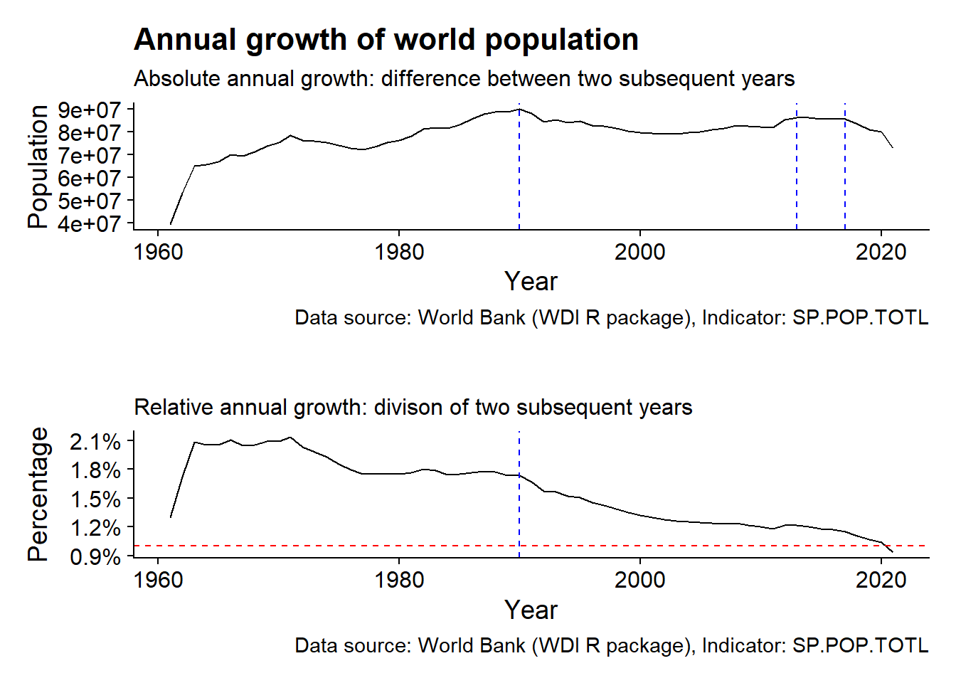
2.2.2 World regions population
Now let’s shift our focus from global to regional level.
We start by adding the regions metadata.
region_pop <- country_pop %>%
  left_join(country_meta)%>% #merge data and metadata tables
  filter(region != "Aggregates") %>% #select regions
  group_by(region, year) %>%
  summarize(SP.POP.TOTL_region = sum(SP.POP.TOTL, na.rm = TRUE))%>%
  ungroup() %>%
  mutate(year = as.integer(year))
## Joining, by = c("country", "iso2c", "iso3c")
## `summarise()` has grouped output by 'region'. You can override using the
## `.groups` argument.We then order the regions based on their initial populations at 1960. This would make it easier and more organized to plot.
region_order <- region_pop %>%
  slice_min(year,n = 1) %>%
  arrange(SP.POP.TOTL_region)
We’ve previously looked at total world population over the years. Now let’s look at the contribution of each region to the world population.
region_pop %>%
mutate(region = factor(region, region_order$region)) %>%
ggplot(aes(year, SP.POP.TOTL_region, fill = region))+
geom_col()+
scale_fill_brewer(palette = "Dark2")+
guides(fill = guide_legend(override.aes = list(size = 0.5)))+
labs(x = "Year",
y = "Percentage",
title = "World regions population",
subtitle = "Regions population between 1960 and 2021, one-year interval",
caption = data_caption)+
theme(legend.position = c(0.05,0.8),
legend.text = element_text(size = 8),
legend.title = element_blank())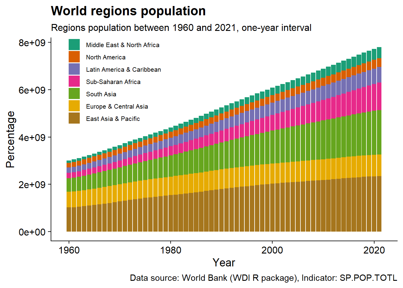 The plot shows that East Asia & Pacific has the largest contribution to world population, while Middle East & North Africa and North America have the smallest.
It’s easier to think of relative contribution rather than absolute.
region_pop %>%
  mutate(region = factor(region, region_order$region)) %>%
  ggplot(aes(year, SP.POP.TOTL_region, fill = region))+
  geom_col(width = 1,
           position = position_fill())+
  scale_y_continuous(labels = scales::percent_format())+
  scale_fill_brewer(palette = "Dark2")+
labs(x = "Year",
       y = "Percentage",
       title = "World regions population",
       subtitle = "Regions population between 1960 and 2021, one-year interval",
       caption = data_caption)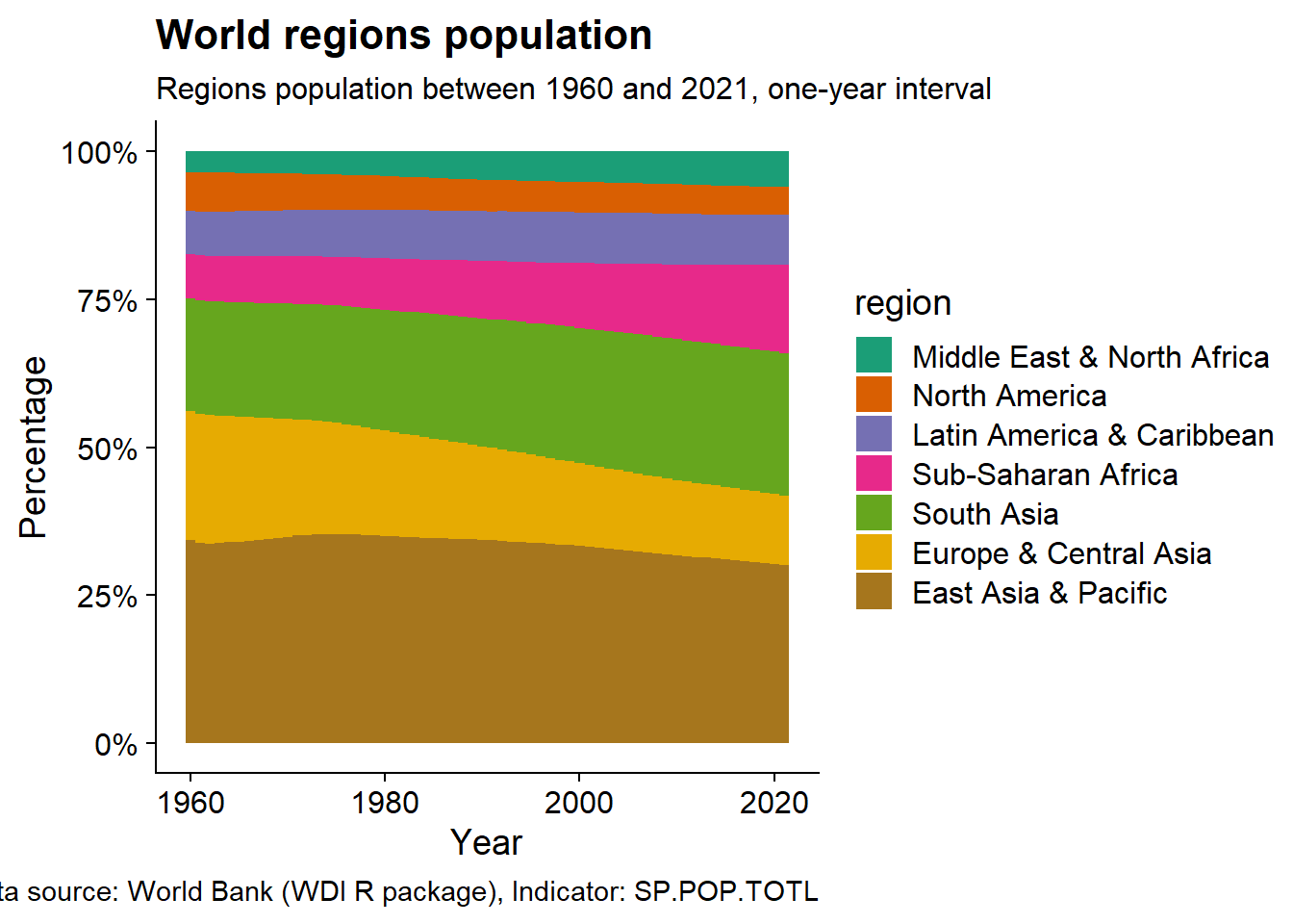
I’ll take this plot step further by removing the legend and annotating the each region “stratum” in the plot. To do this, first, calculate the percentage of ordered regions populations at a 1960. Then, compute the cumulative sum of the percentages. Finally, find the middle of each region layer where the text will be added.
#find the mid-point of each region's layer
region_order <- region_pop %>%
  slice_min(year,n = 1) %>%
  arrange(SP.POP.TOTL_region) %>%
  mutate(region_percent = SP.POP.TOTL_region/sum(SP.POP.TOTL_region),
         region_cum = cumsum(region_percent),
         cum_mid = region_cum-(region_percent/2))
Now let’s look on the improved plot.
region_pop %>%
  mutate(region = factor(region, region_order$region)) %>%
  ggplot(aes(year, SP.POP.TOTL_region, fill = region))+
  geom_col(width = 1,
           position = position_fill(),
           show.legend = FALSE)+
  geom_text(data = region_order,
            aes(year+30, 1-cum_mid, label = region),
            hjust = "middle",
            color = "white")+
  scale_y_continuous(labels = scales::percent_format())+
  scale_fill_brewer(palette = "Dark2")+
labs(x = "Year",
       y = "Percentage",
       title = "World regions population",
       subtitle = "Regions population between 1960 and 2021, one-year interval",
       caption = data_caption)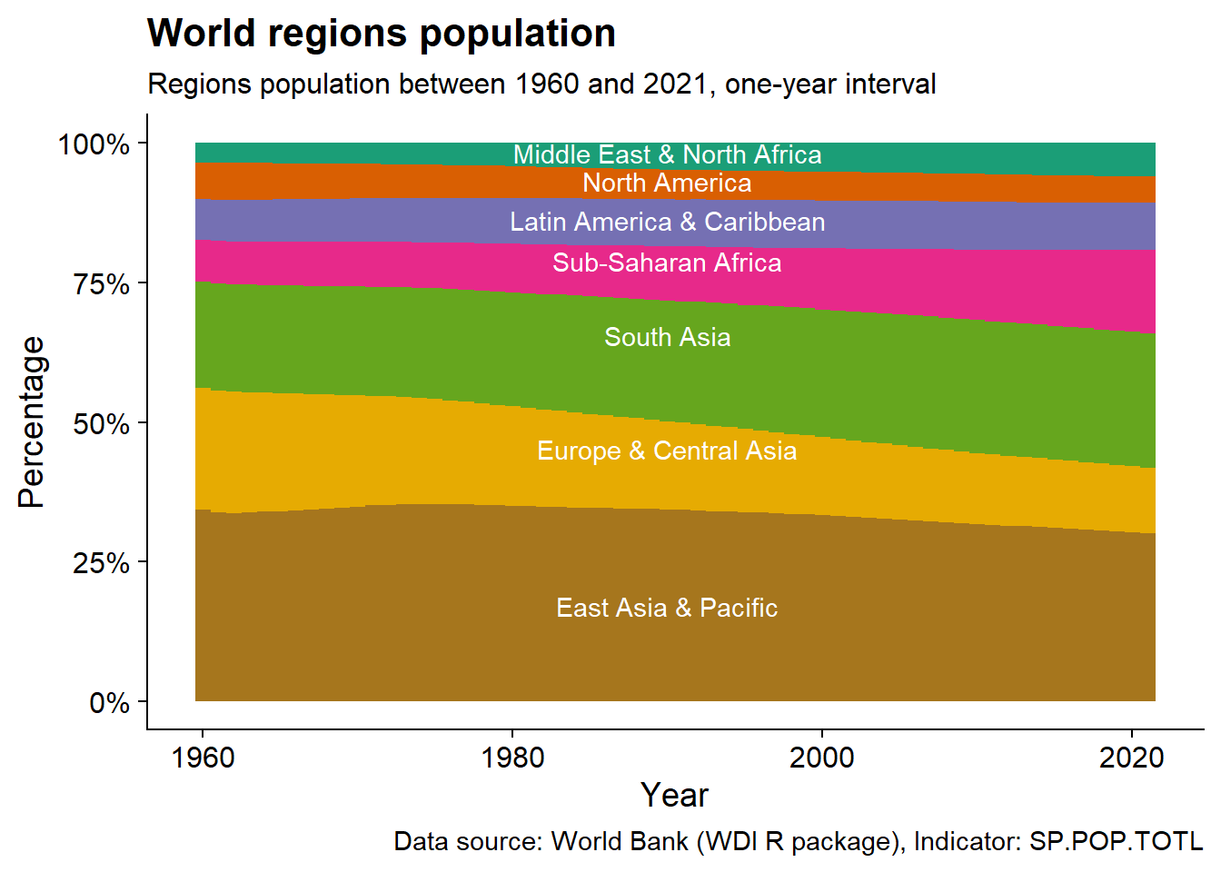
Looks pretty! It’s also easier to read. We can clearly see that East Asia & Pacific has an almost constant contribution -around 30%- to world population. Europe and Sub-Saharan Africa have opposing trend in contribution with the first is first decreasing and the second increasing.
Each world region has a different pattern and magnitude of population growth. Let’s make a heatmap that highlights these differences!
We start by putting all regions on the same scale by calculating the z-score (how many standard deviation away from the mean year).
region_pop <- region_pop %>%
  mutate(region = factor(region, rev(region_order$region))) %>% #maintain the order of regions in the previous plots
  group_by(region) %>%
  mutate(SP.POP.TOTL_region_scaled = scale(SP.POP.TOTL_region)[,1]) %>% #calculate z-score
  ungroup()

global_pop_mean_year <- country_pop %>%
  filter(country == "World") %>%
  mutate(SP.POP.TOTL_region_scaled = scale(SP.POP.TOTL)[,1]) %>%
  slice_min(abs(SP.POP.TOTL_region_scaled), n=1) %$%
  year
Let’s plot the heatmap
region_pop %>%
  ggplot(aes(year, region, fill = SP.POP.TOTL_region_scaled ))+
  geom_tile()+
  #add small bar at the average year for each region
  geom_point(data = . %>% group_by(region) %>% slice_min(abs(SP.POP.TOTL_region_scaled),n=1),
             shape = "|",
             size = 8)+
  #add line at the world average population year
  geom_segment(aes(x = global_pop_mean_year, y = 0.5, xend = global_pop_mean_year, yend = 7.5),
               lty = 2)+
  annotate("text", x = global_pop_mean_year, y = 8, label = "Global (dashed) and region (solid) mean year ")+
  scale_y_discrete(expand = expansion(add = c(0,2)))+
  scale_fill_distiller(palette = "RdBu")+
  labs(x = "Year",
       y = "",
       fill = "Scaled\npopulation",
       title = "World regions population",
       subtitle = "Regions population between 1960 and 2021, one-year interval",
       caption = data_caption)+
  theme(axis.line.y = element_blank(),
        axis.ticks.y = element_blank(),
        #legend specification
        legend.direction = "horizontal",
        legend.position = "top",
        legend.justification="right",
        legend.key.width = unit(0.5, "cm"),
        legend.box.background = element_rect(color="grey20", linewidth=1, fill = "grey95"),
        legend.box.margin = margin(4, 4, 4, 4),
        legend.text = element_text(size = 10),
        legend.title = element_text(size = 10))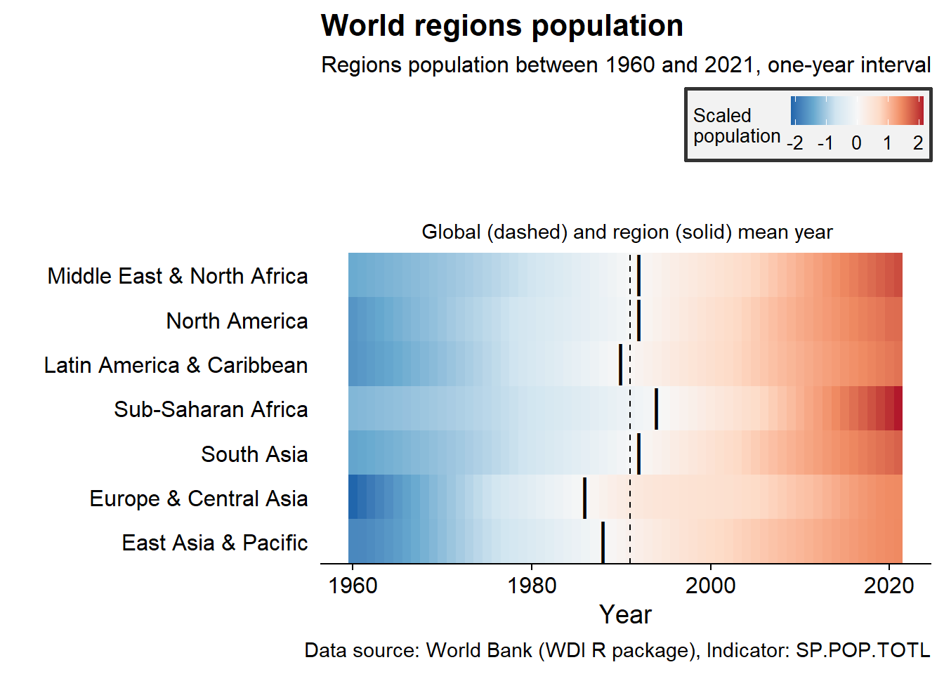
Few patterns pop-out. Sub-Saharan Africa and Middle East & North Africa show the largest region-specific growth. This large growth took place recently and over a short period. Europe had the smallest population at 1960 compared to other years.
Heatmaps are very useful and scalable to visualize large datasets. Neverthelss, for our small dataset, we can simply look at the regions population over the years compared to 2021.
region_pop <- region_pop %>%
  mutate(region = factor(region, rev(region_order$region))) %>%
  group_by(region) %>%
  mutate(SP.POP.TOTL_region_perc = SP.POP.TOTL_region/tail(SP.POP.TOTL_region,1)) %>%#percentage compared to 2021
  ungroup()
Let’s look at the plot
region_pop %>%
  ggplot(aes(year, SP.POP.TOTL_region_perc, color =  region))+
  geom_line(show.legend = FALSE)+
  ggrepel::geom_text_repel(data = . %>% filter(year == 1960),
            aes(label = region),
            force  = 0.5,
            nudge_x = -5,
            direction = "y",
            hjust = 1,
            show.legend = FALSE)+
  scale_color_brewer(palette = "Dark2")+
  scale_y_continuous(labels = scales::percent_format())+
  scale_x_continuous(breaks = seq(1960,2020, by = 10),
                     expand = expansion(add = c(30,3)))+
  labs(x = "Year",
       y = "Scaled cumulative growth",
       title = "World regions population growth",
       subtitle = "Relative population growth of world regions since 1960 compared to 2021",
       caption = data_caption)+
  theme(legend.position = c(0.6, 0.3))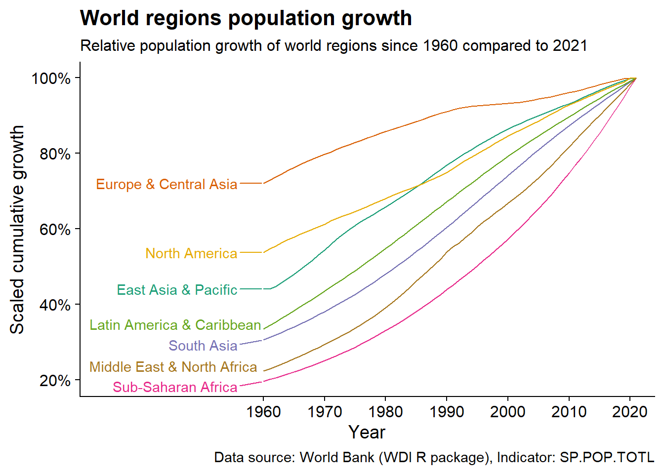
Europe & Central Asia population grew by only 30% since 1960 compared to Middle East & North Africa and Sub-Saharan Africa huge 80% growth!
Similarly, is to compare population over the years to 1960.
region_pop <- region_pop %>%
  mutate(region = factor(region, rev(region_order$region))) %>%
  group_by(region) %>%
  mutate(SP.POP.TOTL_region_start = log2(SP.POP.TOTL_region/head(SP.POP.TOTL_region,1))) %>%
  ungroup()
Let’s look at the plot
region_pop %>%
  ggplot(aes(year, SP.POP.TOTL_region_start, color =  region))+
  geom_line(show.legend = FALSE)+
  ggrepel::geom_text_repel(data = . %>% filter(year == 2021),
            aes(label = region),
            force  = 0.5,
            nudge_x = 5,
            direction = "y",
            hjust = "left",
            show.legend = FALSE)+
  scale_color_brewer(palette = "Dark2")+
  scale_x_continuous(breaks = seq(1960,2020, by = 10),
                     expand = expansion(add = c(3,30)))+
  labs(x = "Year",
       y = "Fold increase relative to 1960",
       fill = "Scaled\npopulation",
       title = "Relative world regions growth",
       subtitle = "World regions population growth over the years, relative to 1960",
       caption = data_caption)+
  theme(legend.direction = "horizontal",
        legend.position = "top",
        legend.justification="right",
        legend.key.width = unit(0.75, "cm"),
        legend.box.background = element_rect(color="grey20", linewidth=1, fill = "grey95"),
        legend.box.margin = margin(4, 4, 4, 4))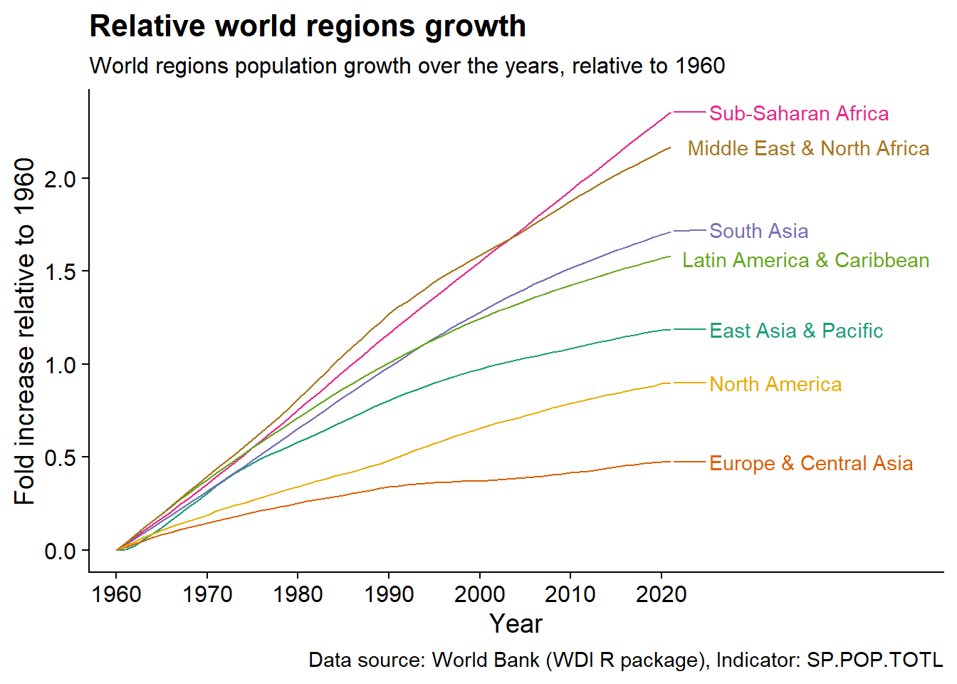
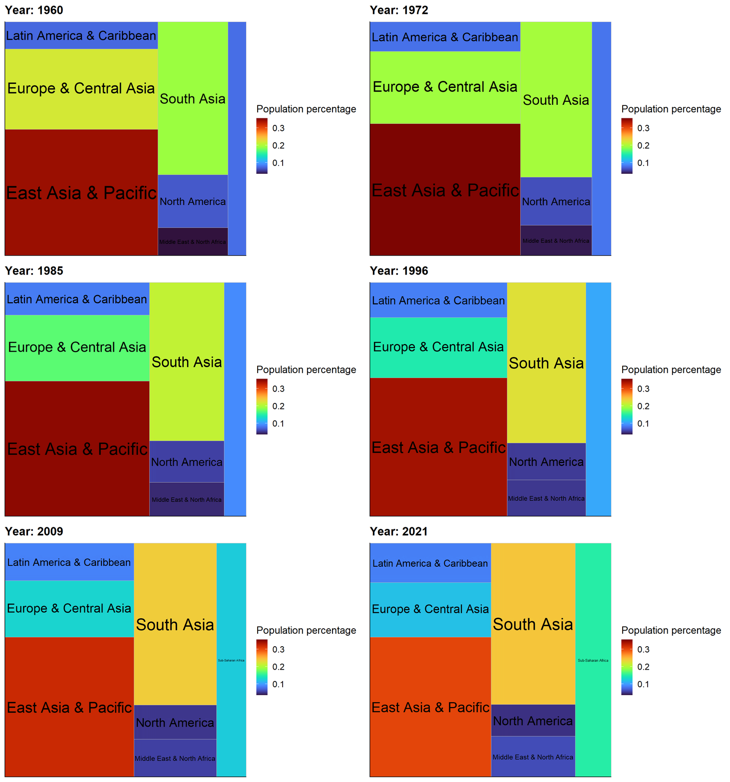
Finally, let’s look at an animated plot of how the regions percentage change of the total world population over the years
region_pop <- region_pop %>%
  mutate(region = factor(region, rev(region_order$region))) %>%
  group_by(year) %>%
  mutate(SP.POP.TOTL_region_year_perc = SP.POP.TOTL_region/sum(SP.POP.TOTL_region)) %>%
  ungroup()
region_pop %>%
ggplot(aes(
label = region,
area = SP.POP.TOTL_region_year_perc,
fill = SP.POP.TOTL_region_year_perc
)) +
geom_treemap(layout = "fixed") +
geom_treemap_text(layout = "fixed", place = "centre", grow = TRUE, colour = "black") +
viridis::scale_fill_viridis(option = "turbo")+
transition_time(year) +
ease_aes('linear') +
labs(title = "Year: {frame_time}", fill = "Population percentage")