1.4 What is the history of bidding for world cup?
Now let’s shift our focus to yet another interesting question. In this section we will explore the bidding history to host the world cup.
Let’s start by making a bar-plot that show the number of successful bids out of all submitted bids for each country.
We start by sorting the countries based on the number of world cup bids, then the times hosted.
(bar_bid_df1 <- tbls_lst$total_bids_by_country %>%
   distinct(country_name, bids, times_hosted) %>% #select unique entries
  arrange(bids,times_hosted) %>%
  mutate(country_name = factor(country_name, levels = unique(country_name))) )
## # A tibble: 35 × 3
## country_name bids times_hosted
## <fct> <int> <dbl>
## 1 Austria 1 0
## 2 Belgium 1 0
## 3 Egypt 1 0
## 4 Greece 1 0
## 5 Hungary 1 0
## 6 Iran 1 0
## 7 Libya 1 0
## 8 Nigeria 1 0
## 9 Peru 1 0
## 10 Portugal 1 0
## # … with 25 more rowsNext, we add a layer of bars showing the times of bids using a transparent color
(bar_bid_plt <- bar_bid_df1 %>%
  ggplot()+
  geom_col(aes(country_name, bids), fill = "#35978f", alpha = 0.3))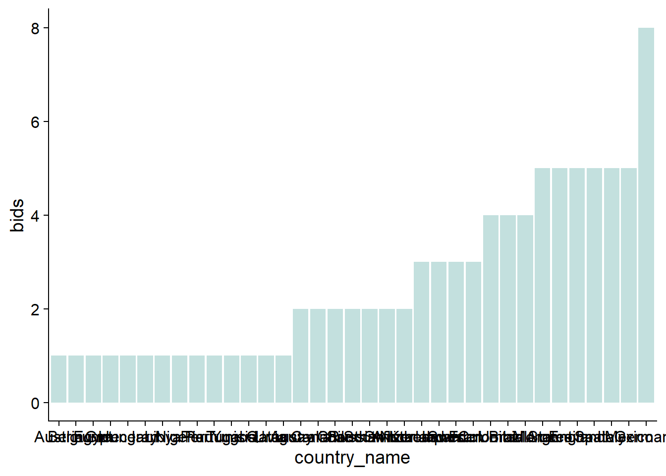
Oh, obviously we would benefit from flipping the axes to avoid overlap of countries’ names. We can also add yet another layer of bars showing the times hosted using a solid version of the same color.
(bar_bid_plt <-bar_bid_plt +
  geom_col(aes(country_name, times_hosted), fill = "#35978f", alpha = 1)+
  coord_flip())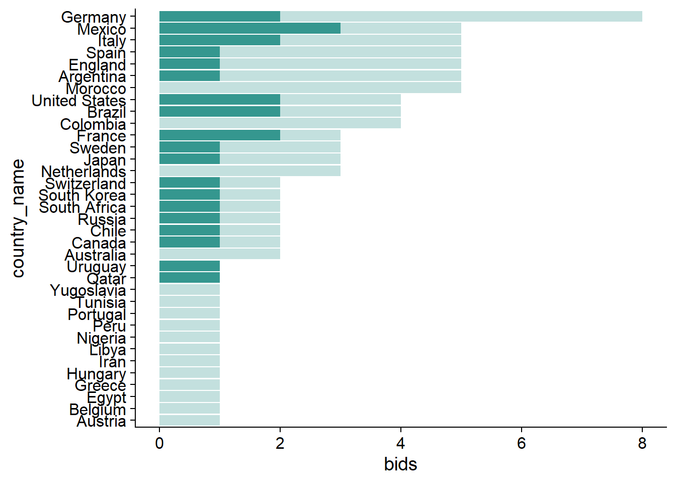
Almost done! Let’s change the background color and add title.
(bar_bid_plt <- bar_bid_plt +
   #add text
  labs(title = "History of hosting FIFA world cup",
     subtitle = "Number of world cup bids compared to times hosted",
     caption = caption_cdc,
       y = "Numer of bids")+
   #define theme
  theme(axis.title.y = element_blank(),
      axis.text.y = element_text(size = 7.6),
      plot.background = element_rect(fill =  "#FAECD6"),
        panel.background = element_rect(fill =  "#FAECD6"),
        title = element_text(colour = "#01665e", size = 9)))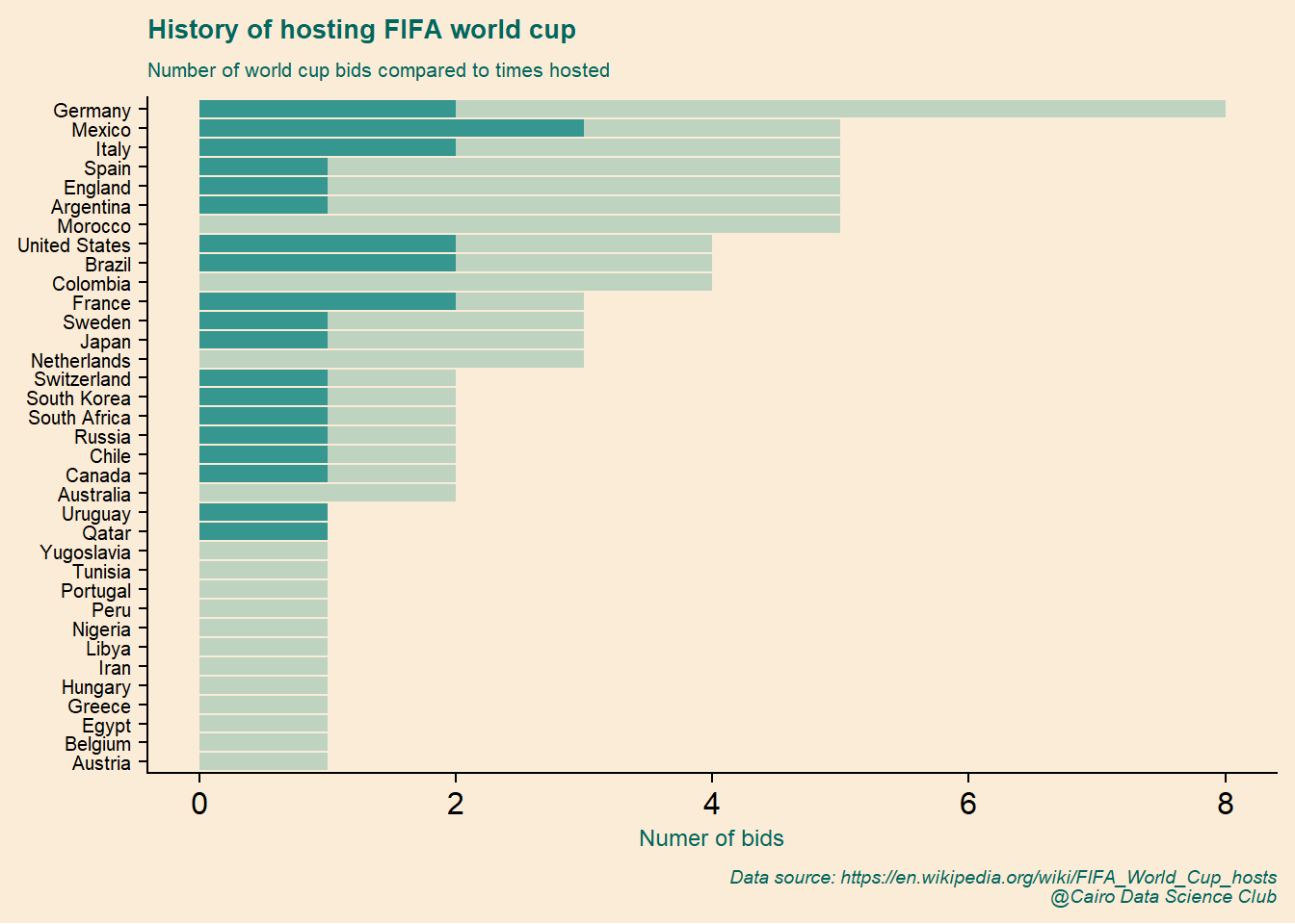
We’ll finish this plot by adding an image of the world cup to the background!
bar_bid_plt+
  #add world cup image
  ggimage::geom_image(data = data.frame(x = 16, y = 7),
                      aes(x,y),
                      image = wc_img,image_fun = transparent,
                      size = 1.1)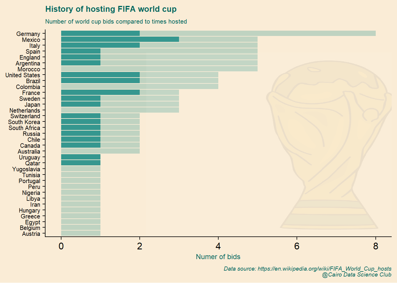
Nice! The plot shows that most of the time, it takes more than one bid to host the world cup.

Next, we’ll focus on the relationship between bidding times and number of hosting world cup using a point plot.
let’s start by simply ploting the number of bids on the x-axis and the time hosted on the y-axis
(point_bid_plt <- bar_bid_df1 %>%
  ggplot(aes(bids, times_hosted))+
  geom_point(color = "#35978f"))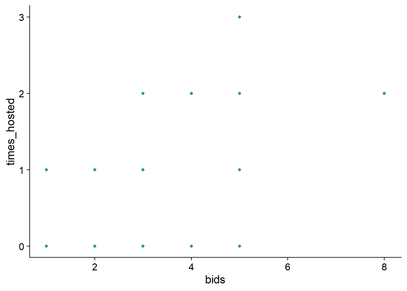
Next, we need to know what each point represent. To do that, we add the name of the country to the corresponding point.
(point_bid_plt <- point_bid_plt+
  geom_text(aes(label = country_name),
            size = 4))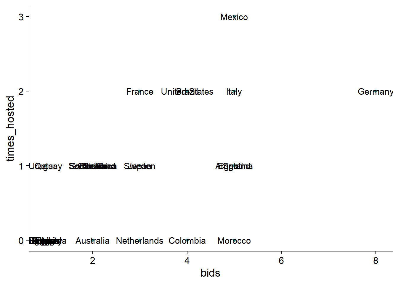
Oh no! Since many countries have the same number bids and hosting statistics, we end up with a dramatic case of text over-plotting.

To overcome this, we’ll replace geom_text() with geom_text_repel() from the package ggrepel. Let’s first look at the effect of this function and then explain what it does.
#remove the last layer added of geom_text() before using geom_text_repel()
point_bid_plt$layers[[2]] <- NULL

#add countries' names while avoiding text overlap
(point_bid_plt <- point_bid_plt+
  ggrepel::geom_text_repel(aes(label = country_name),
                           size = 4,
                           min.segment.length = 0,
                           max.overlaps = Inf,
                           segment.color="grey60",
                           box.padding = 0.4
                            )+
  #expand the plotting panel to free some room for the repelled text
  scale_x_continuous(breaks = 1:8,
                     expand = expansion(add = c(1,0.5)))+
  scale_y_continuous(breaks = 0:3,
                     expand = expansion(add = c(1,0.5))))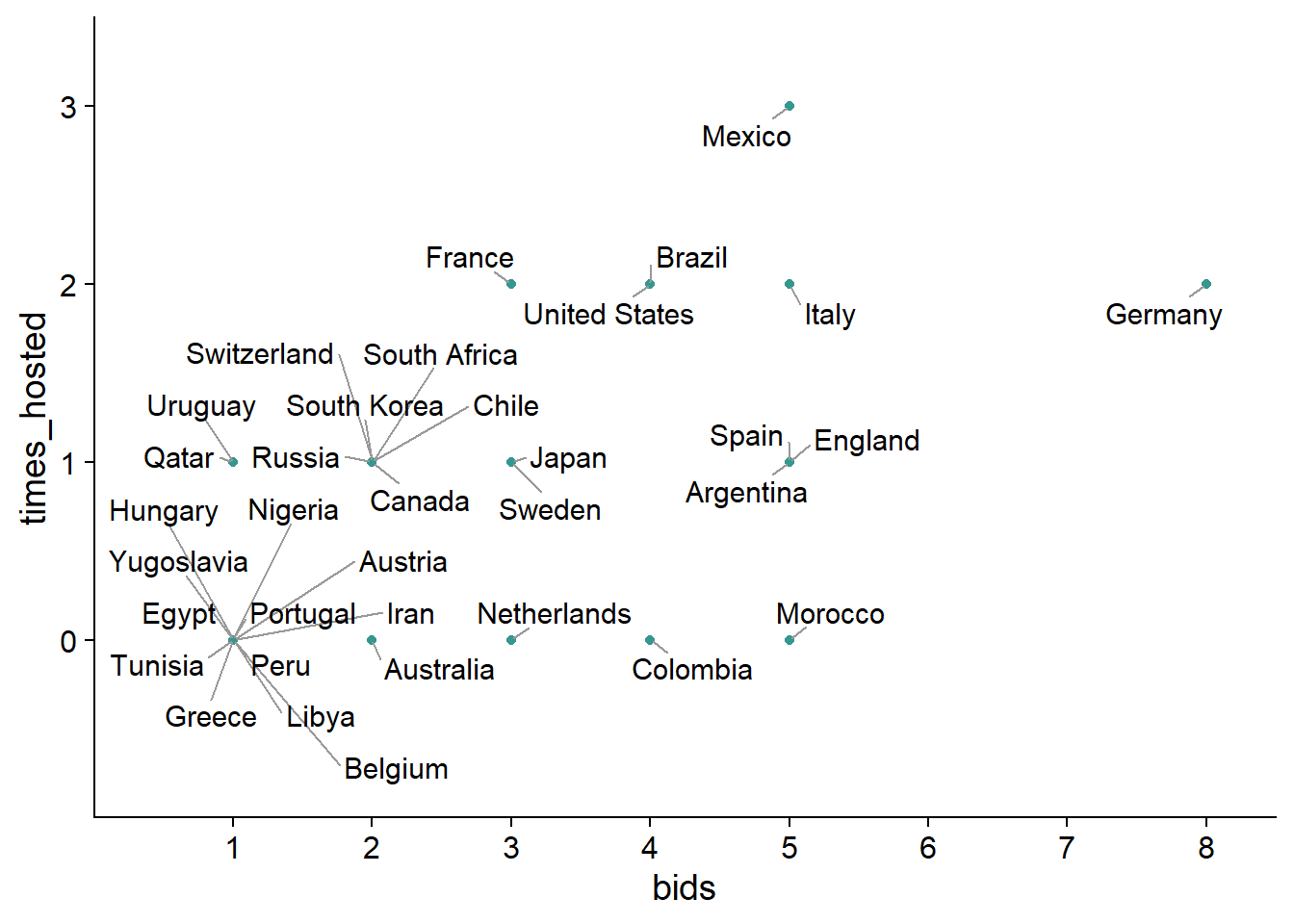
Nice! We achieved the desired effect using geom_text_repel() which makes the text repel away from each other to avoid over-plotting. The text also repel away from the edges of the plot. To avoid the undesired effect of the later, we expanded the plotting area using the function expansion() in x and y direction
Let’s finish this plot by adding world cup image, the title, and beautify the plot by coloring the background
point_bid_plt+
   #add world cup image
  ggimage::geom_image(data = data.frame(x = 7, y = 1.2),
                      aes(x,y),
                      image = wc_img,image_fun = transparent,
                      size = 1.2)+
  labs(title = "History of hosting FIFA world cup",
       subtitle = "Number of world cup bids compared to times hosted",
       caption = caption_cdc,
       x = "Numer of bids",
       y = "Number of times hosted")+
  theme(plot.background = element_rect(fill =  "#FAECD6"),
        panel.background = element_rect(fill =  "#FAECD6"),
        panel.grid.major = element_line(colour = "white"),
        title = element_text(colour = "#01665e"))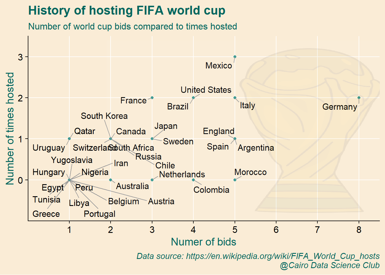
It’s clear that Germany has the lion’s share of submitted bids, while Morocco is obviously lacks a bit of luck!
What’s missing in the plots above is the time where bids and hosting took place.
Wouldn’t it be interesting to have a single plot showing for each country when each bid and hosting took place? I would say YES!

Let’s work towards building this exciting plot!
We’ll start by merging data about hosting and bidding.
df_bid_host1 <- tbls_lst$list_of_hosts %>%
  full_join(tbls_lst$total_bids_by_country) %>%
  #remove years when the world cup was cancelled
  filter(!str_detect(country_name, "Cancelled")) %>%
  #order countries based on numer of bids
  arrange(bids) %>%
  mutate(country_name = factor(country_name, levels = unique(country_name)),
         bids = factor(bids, levels = sort(unique(bids), decreasing = TRUE)))
## Joining, by = c("country_name", "country_code")The data is ready for visual inspection! The idea is to make a tile plot showing the year on the x axis and country on the y axis.
(tile_bid_host_plt <- df_bid_host1 %>%
  ggplot()+
  geom_tile(aes(year, country_name),
            fill = "#c7eae5", color = "white", size = 0.5) )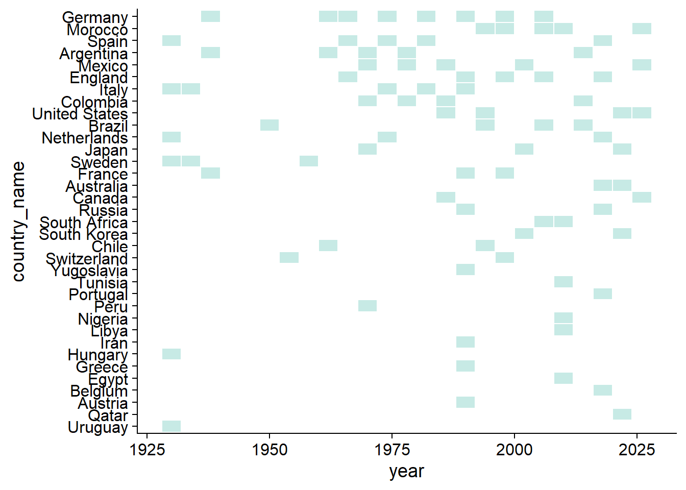
This plot shows the year at which each country bid to host the world cup!
Next, we add the hosting information by selecting the countries that hosted the world cup at least once
df_bid_host2 <- df_bid_host1 %>%
              filter(times_hosted>=1 & host_year == year)
Now we add another layer of tiles with solid color showing the years of hosting the world cup.
(tile_bid_host_plt <- tile_bid_host_plt +
  geom_tile(data = df_bid_host2,
            aes(year, country_name),
            fill="#35978f", color = "black", size = 0.5))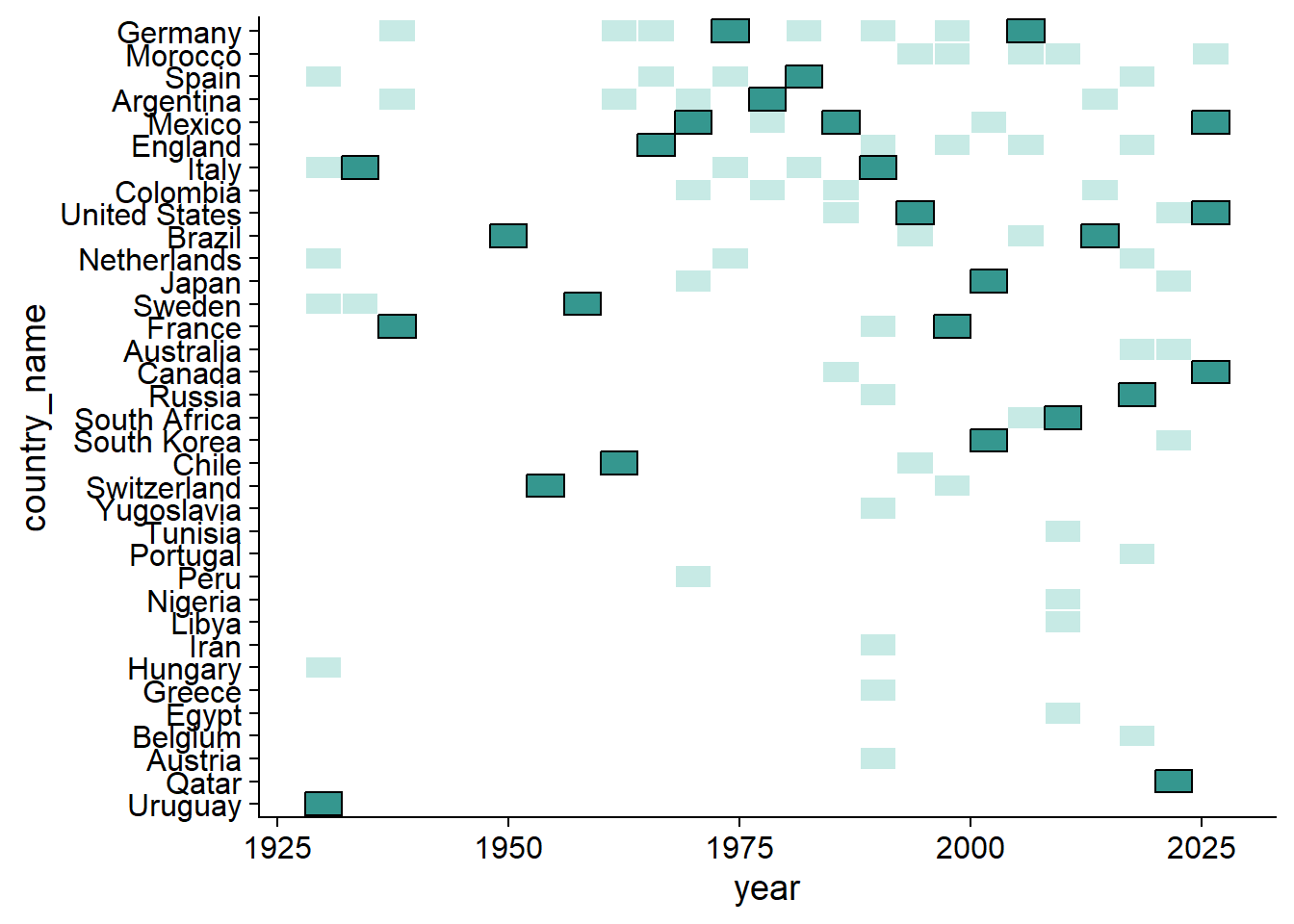
This looks nice!
Whether you’re a football fan or have an observant eye, it’s not difficult to tell that there are gap years in the plot in which the world cup was cancelled. Let’s highlight this part of the plot to, first, give a complete picture of the history of hosting the championship and , second, to make it clear that it’s not a case of missing data.
(tile_bid_host_plt <- tile_bid_host_plt +
  #add a transparent rectangle between 1942 and 1946
  geom_rect(data = tibble(xmin = 1942, xmax = 1946, ymin = -Inf, ymax = Inf),
            mapping = aes(ymin = ymin, ymax = ymax, xmin = xmin, xmax = xmax),
            alpha = 0.05,
            fill = "black",
            color = "black",
            size = 0.1,
            inherit.aes = FALSE)+
  #overlay an explanation on top the rectangle
  annotate("text",
           angle = 90, x = 1944, y = 17.5,size = 2.5,color = "black",
           label = "World Cups of 1942 and 1946 were both cancelled because of WW2")+
  #represet years on the x axis with 4 year interval between 1930 and 2026
  scale_x_continuous(breaks = seq(1930, 2026,4)))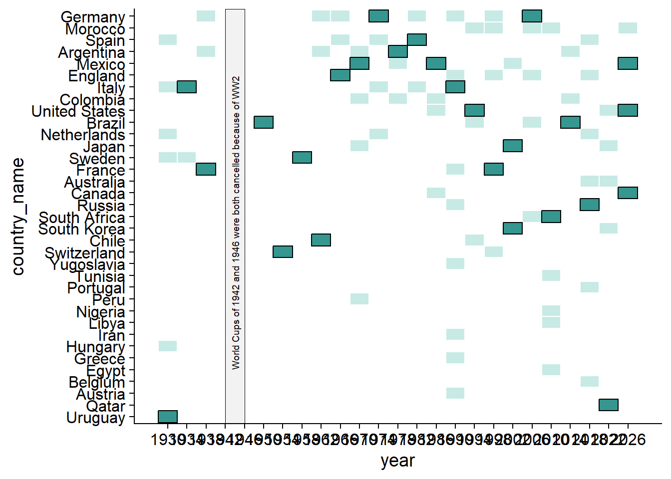
Let’s finish by adding the title, removing the y axis, rotating the x-axis text to make it more readable, and other minor things.
(tile_bid_host_plt <- tile_bid_host_plt +
    #add title for context
  labs(title = "History of hosting FIFA world cup",
       subtitle = "Timeline of bidding (faint boxes;no outline) and hosting (dark boxes;black outline) countries of FIFA world cup",
       caption = caption_cdc)+
  theme(title = element_text(size = 9),
        axis.text.x = element_text(size = 8, angle = 45,hjust = 1), #rotate dates
        axis.ticks.y = element_blank(),#remove y axis
        axis.line.y = element_blank(),
        axis.title.y = element_blank(),
        axis.text.y = element_text(size = 7.6),
        panel.grid.major = element_line(colour = "grey80"),#add horizontal grid
        panel.grid.major.x = element_blank()))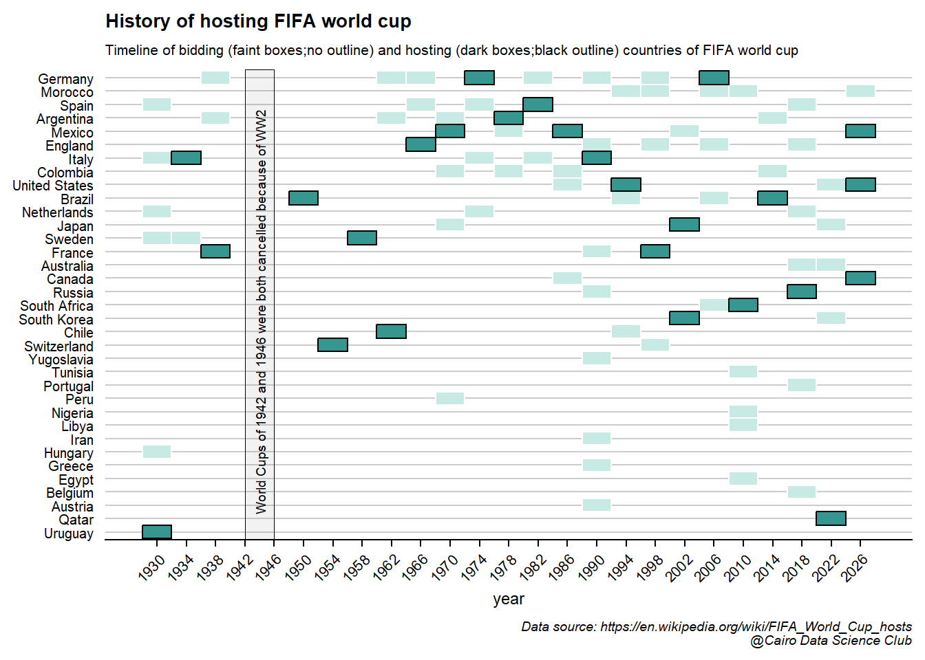
This a comprehensive, yet clear, visualization of bidding and hosting the world cup! We can simultaneously make interesting observations about the years (e.g. 1990 and 2019 received the largest number of bids!) and the history of the hosting countries (e.g. 2026 will be the first world cup to be hosted by three countries!).

But wait, this is not all …
Let’s take this plot to next level and augment it with the results of the hosting countries!
To start with, we define colors of the different results (First place, runner up, third place, … etc)
res_cols <- c("#FFD700",
              "#d9d9d9",
              "#CD7F32",
              "#f6e8c3",
              "#969696",
              "#737373",
              "#525252",
              "#000000"
              )
names(res_cols) <- results_order[-length(results_order )]
Let’s piece everything together for one last time. We start by defining the tiles layer and color the bids and hosts differently.
(tile_bid_host_plt2 <- df_bid_host1 %>%
  ggplot()+
  #tiles for bidding
  geom_tile(aes(year, country_name),
            fill = "grey85", color = "white", size = 0.5) +
  #over-plot tiles of the results
  geom_tile(data = tbls_lst$host_country_performances %>%
              filter(result != "TBD") ,
            aes(year, country_name, fill = result),
             color = "black", size = 0.5) +
  #add results colors
  scale_fill_manual(values = res_cols))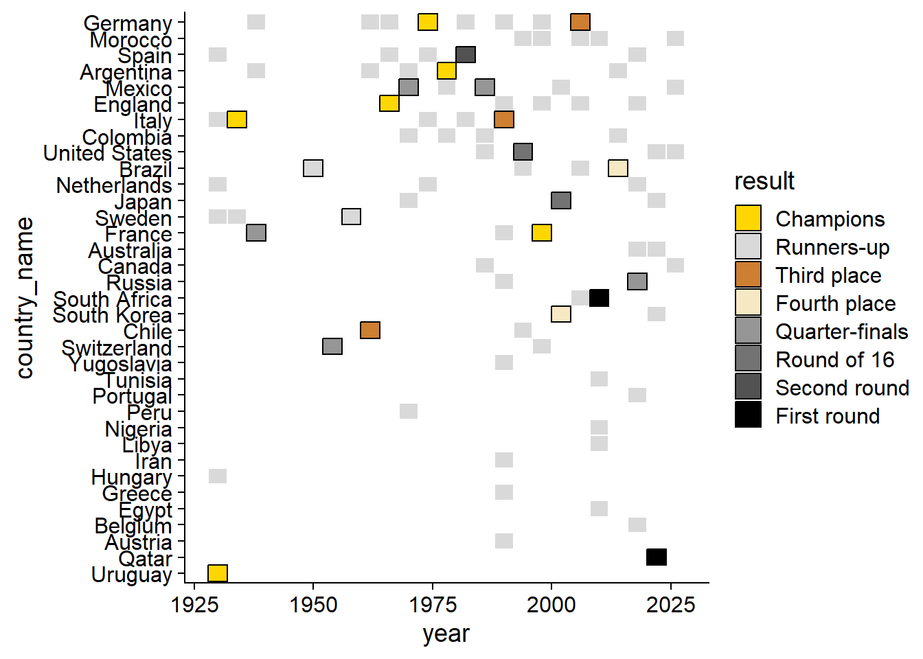
We then break the x-axis by 4 years interval and add the world cup in the background. Furthermore, as a cherry on top, will add respective flag of each country.
(tile_bid_host_plt2 <- tile_bid_host_plt2+
  #define the years intervals shown on the x axis and expand left side for the flags
  scale_x_continuous(breaks = seq(1930, 2026,4),
                     expand = expansion(add = c(4,NA)))+
   #add country flag
  ggimage::geom_flag(data = . %>%
                       filter(!is.na(country_code)) %>%
                       distinct(country_name, country_code),
                     aes(y = country_name, image=country_code),
            x = 1925,
            size =0.03)+
   #add world cup image
  ggimage::geom_image(data = data.frame(x = 1952, y = 18),
                      aes(x,y),
                      image = wc_img,image_fun = transparent,
                      size = 1.2))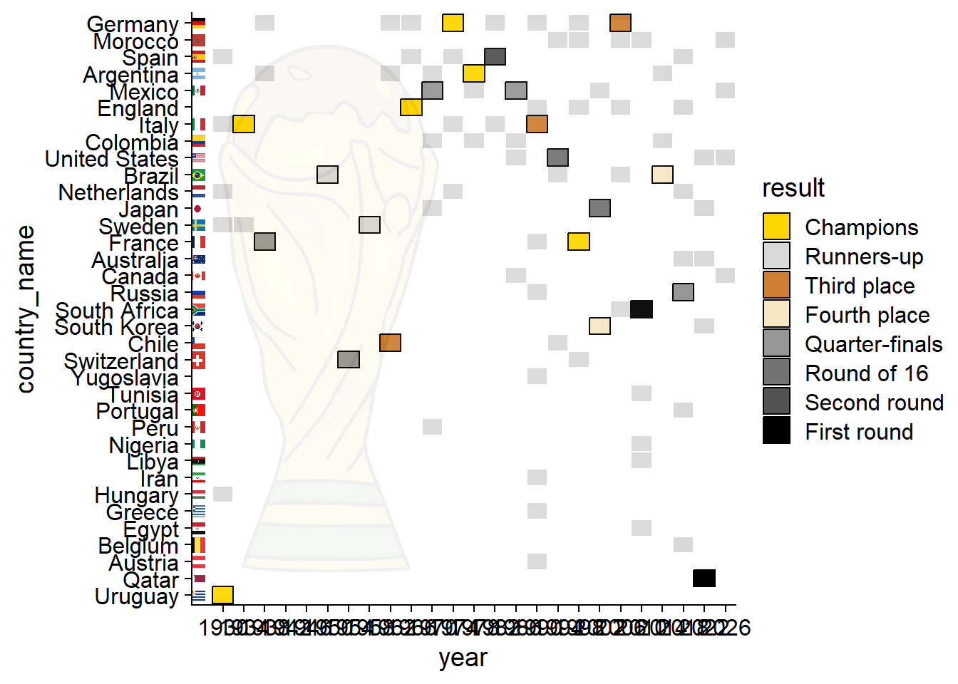
Already tired? We’re almost there!

Next, we highlight and annotate the cancelled years
(tile_bid_host_plt2 <- tile_bid_host_plt2 +
  #add rectangle to highlight cancelled years
  geom_rect(data = tibble(xmin = 1942, xmax = 1946, ymin = -Inf, ymax = Inf),
            mapping = aes(ymin = ymin, ymax = ymax, xmin = xmin, xmax = xmax),
            alpha = 0.05,
            fill = "black",
            color = "black",
            size = 0.1,
            inherit.aes = FALSE)+
  #Annotate the rectangle
  annotate("text",
           angle = 90, x = 1944, y = 17.5,size = 2.5,color = "black",
           label = "World Cups of 1942 and 1946 were both cancelled because of WW2"))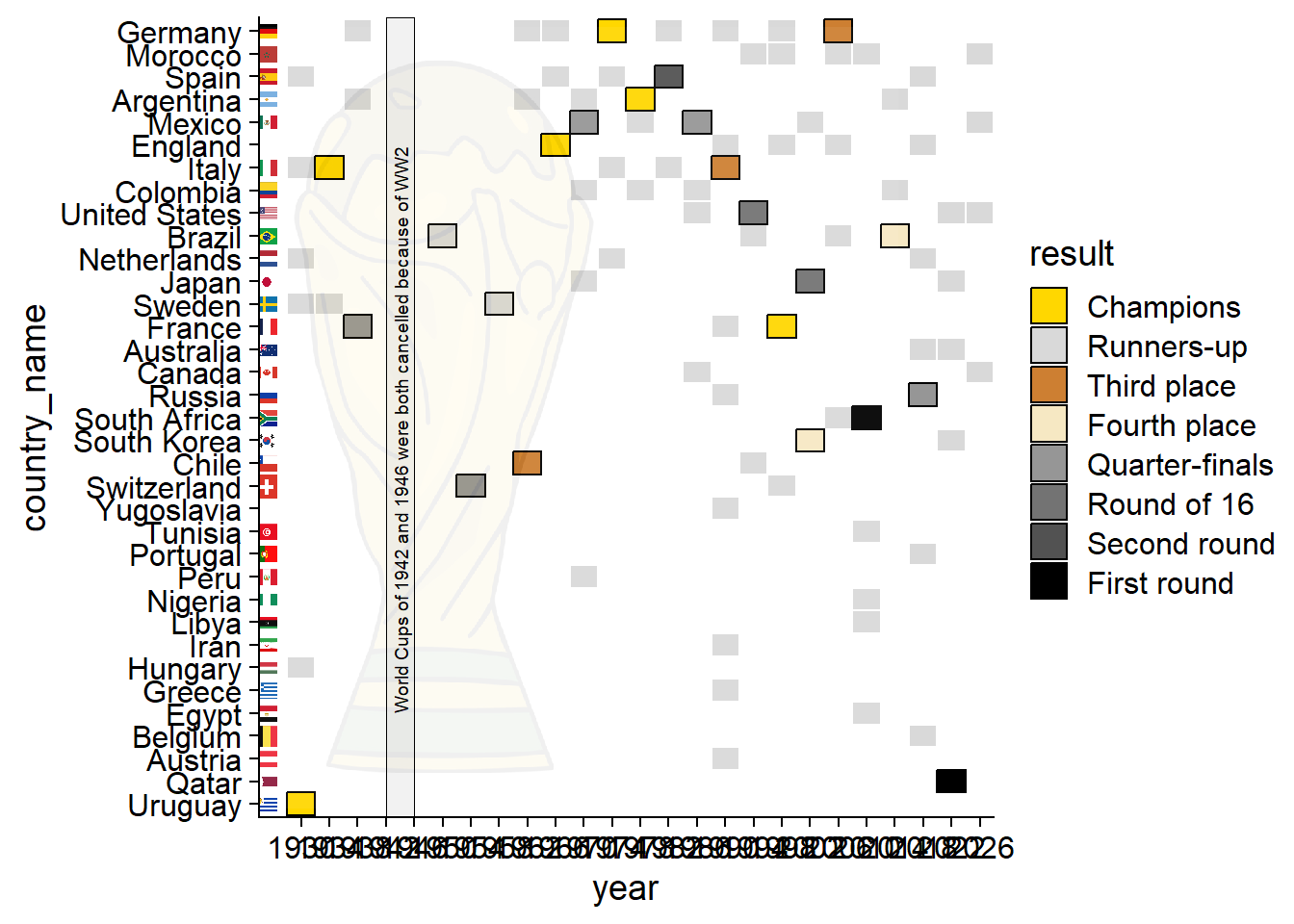
Finally, add the title for context and the modify the theme
tile_bid_host_plt2 +
  #define title and subtitle
  labs(title = "History of hosting FIFA world cup",
       subtitle = "Timeline of bidding (faint boxes;no outline) and hosting (dark boxes;black outline) countries of FIFA world cup",
       caption = caption_cdc)+
  #control the order and size of the legend keys
  guides(fill = guide_legend(nrow = 1,
                             keywidth = 0.85,
                             keyheight = 0.25))+
  theme(title = element_text(size = 9),
        axis.text.x = element_text(size = 8, angle = 45,hjust = 1),
        axis.ticks.y = element_blank(),
        axis.line.y = element_blank(),
        axis.title.y = element_blank(),
        axis.text.y = element_text(size = 7.6),
        panel.grid.major = element_line(colour = "grey80"),
        panel.grid.major.x = element_blank(),
        legend.title = element_blank(),
        legend.text = element_text(size = 6.9),
        legend.spacing.x = unit(0.1,"cm" ),
        legend.position = "top"
        )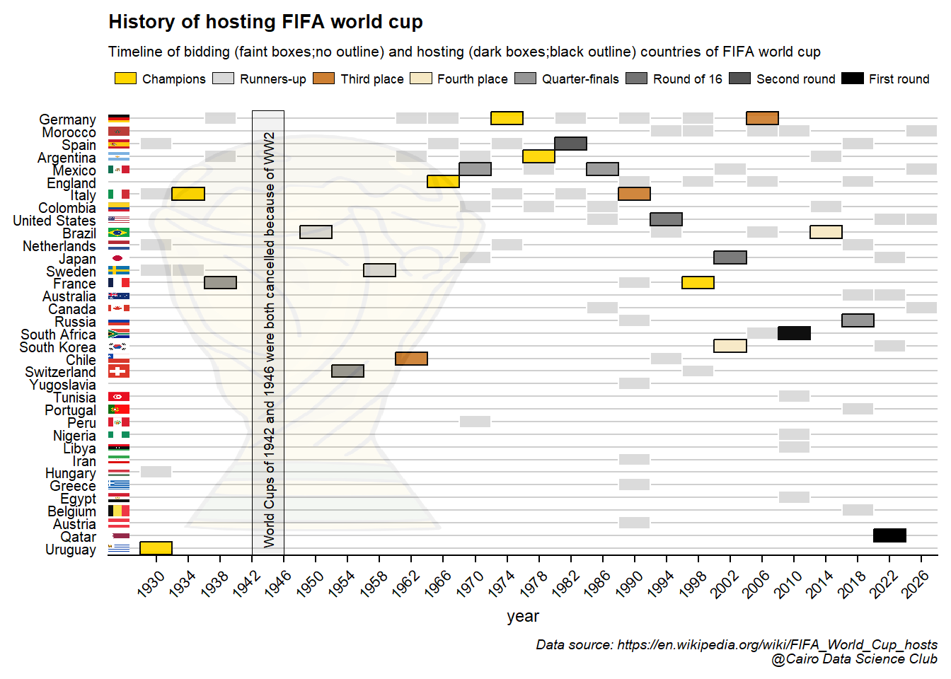
WOW! We managed to summarize the history of world cup in a single plot!
Mission accomplished!